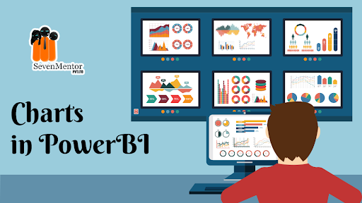
Charts in PowerBI
Choosing the right Charts in PowerBI depends on the type of data you have and the insights you want to convey. Here are some common types of charts. Unlock the potential of data visualization and analytics. Join our expert-led courses for hands-on learning and gain valuable insights. Elevate your skills with real-world projects certified Power BI professional. Enroll now and chart a successful career path in business intelligence
Column Chart:
- Use when comparing values across different categories.
- Suitable for showing trends over time or comparing individual items.
Bar Chart:
- Similar to a column chart but with the axes switched.
- Use when comparing values for different categories or items.
For Free, Demo classes Call: 075074 14653
Registration Link: Click Here!
Line Chart:
- Ideal for showing trends over a continuous interval or time series data.
- Use when visualizing data with a clear sequence.
Area Chart:
- Suitable for displaying the cumulative contribution of different data series.
- Use when emphasizing the magnitude of change over time.
Pie Chart:
- Use when you want to show the proportion of parts to a whole.
- Avoid using pie charts with too many slices, as they can become hard to interpret.
Note: Empower your career with comprehensive Power BI training in Pune!
Donut Chart:
- Similar to a pie chart but with a hole in the center.
- Use when you want to convey the same information as a pie chart but with a focus on overall proportions.
Scatter Plot:
- Ideal for visualizing the relationship between two numerical variables.
- Use when looking for patterns, correlations, or outliers.
Bubble Chart:
- A variation of the scatter plot with an additional dimension represented by the size of the bubbles.
- Useful for visualizing three dimensions of data.
For Free, Demo classes Call: 075074 14653
Registration Link: Click Here!
Treemap:
- Effective for displaying hierarchical data as nested rectangles.
- Use when illustrating proportions within a hierarchy.
Gauge Chart:
- Use when you want to show progress toward a goal or a single value within a defined range.
- Suitable for displaying KPIs (Key Performance Indicators).
For Free, Demo classes Call: 075074 14653
Registration Link: Power BI course in Pune!
Map:
- Useful for visualizing geographic or spatial data.
- Use when you have location-based information.
Combo Chart:
- Combines different chart types on the same axis.
- Useful when you want to show multiple trends or comparisons in a single chart.
Funnel Charts
- Visualizes the data that flows from one phase to another phase.
- In the funnel chart, the whole data is considered as 100%, and in each phase, it is represented as numerical propositions of the data.
Visit our channel to learn more: Click Here
Author:
Karishma Pawar
Call the Trainer and Book your free demo Class For PowerBI Call now!!!
| SevenMentor Pvt Ltd.
© Copyright 2021 | SevenMentor Pvt Ltd.

