Bootstrap Classes
Bootstrap provides n number of classes to style HTML elements. It is having a number of templates also which are very useful to create a responsive website. These templates and classes reduce efforts to design and style your website. Following are some of the useful classes available in Bootstrap:
- Contextual Color
- Table
- Image
- Forms
- Buttons
1. Contextual Color:-
To specify a color to a particular element we are having different color classes which can be applied to text and background also. To apply color to the text we have to use the class text-color name and to apply color as the background we have to specify the color class as a bg-color name.
e.g. The classes for text colors are text-muted, text-primary, text-success, text-info, text-warning, text-danger, text-secondary, text-white, text-dark, text-body, and text-light.
The classes for background colors are: .bg-primary, .bg-success, .bg-info, .bg-warning, .bg-danger, .bg-secondary, .bg-dark , and .bg-light.
For Free, Demo classes Call: 8237077325
Registration Link: Click Here!
2. Tables:-
Different types of tables you can create by using table class in Bootstrap. Following are the classes which can be used to create a table:
table, table-striped, table-bordered, table-hover, table-dark , table-borderless , table-responsive and you can add color classes also to style your bootstrap table.

3. Images:-
Following classes can be added to images to style them:
To display image with rounded corners use .rounded class.
e.g. <img src=”abc.jpg” class=”rounded” alt=”abc”>
To display image in circle shape use .rounded-circle class.
e.g. <img src=”abc.jpg” class=”rounded-circle” alt=”abc”>
To display image as thumbnail use .img-thumbnail class.
e.g. <img src=”abc.jpg” class=”img-thumbnail” alt=”abc”>
To align image to a particular position use following classes:
float-start class will align image to left, float-end class will align image to right and mx-auto and d-block classes will align the image to the center of the page. SevenMentor is one of the top and most renowned web designing and Front End Development Training in Pune
To make an image responsive use img-fluid class.
For Free, Demo classes Call: 8237077325
Registration Link: Click Here!
4:Forms:-
To insert forms on webpage classes are used according to the form element which you want to insert on web page.
e.g. form-control class is used to insert all the text elements like textbox, email, password, date, textarea, number etc.
form-select class is used to insert a dropdown menu using select tag.
Form-check class is used to insert checkboxes and radio buttons on the web page.
To insert labels label will be added to the respective class.
e.g. form-control-label
5. Buttons:-
Bootstrap provides different styles of buttons by using contextual colors. btn class is used to create a button. You can add contextual color cases to btn class.
e.g. btn-primary
btn-outline class with contextual colors is used to create a bordered button . This button displays its full color when the user places the mouse pointer on button.
A block-level button can be created using d-grid class. This button occupies the whole space of the parent element.
gap class with number adds space between two buttons.
e.g. gap-3
You can also create active, disabled, and spinner buttons.
If you want you can create button groups using btn-group class. To place buttons vertically you can add btn-group-vertical class. You can create multiple button groups by nesting button classes.
Users can create HTML elements in different sizes using different classes such as:
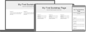
xs class will create an extra small element for smaller screens like mobile.
Sm class will create a small element for screens like a tab.
Md class will create a medium element for screens like laptops.
Lg class will create a large element for screens like desktops.
The container class will place all your elements by leaving same space from both sides of the screen.
The container-fluid class will occupy the whole screen to insert elements on the web page.
Bootstrap uses a grid system to insert elements on the web page where each row is divided into 12 columns. You can merge the columns to increase the width of the area to insert elements.
To create a row bootstrap uses the row class and to create columns it uses col class with a number.
e.g. To combine to columns in a row you can use the following tag:
<div class=”row”>
<div class=”col-4”>….</div>
<div class=”col-8”>….</div>
</div>
For Free, Demo classes Call: 8237077325
Registration Link: Click Here!
Bootstrap provides multiple components which can be added to your web pages. They are available in the components section.
e.g. accordion, modal, off-canvas, tooltips, pagination, navbar, breadcrumb, alerts, buttons, dropdowns, etc.
Utility section of Bootstrap provides different classes which are useful to apply css style to your elements.
e.g. flex, position, spacing, vertical alignment, display etc.
Author:
| SevenMentor Pvt Ltd.
© Copyright 2021 | SevenMentor Pvt Ltd.

