K-means clustering:
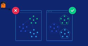
K-means clustering is the most used clustering algorithm. A centroid-based algorithm and a very simple unattended learning algorithm. This algorithm attempts to reduce the variation in data points within a collection. It is a way for many people to be informed about unsupervised machine learning. K means methods are best used in small data sets because they run over all data points. That means it will take a lot of time to separate data points if there is a large number of them in the data set.
Implementation:
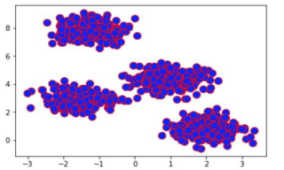
Let’s import the toy dataset from scikit-learn and visualize the data points of dataset make_blobs using 4 clusters with 1000 samples,
| import matplotlib.pyplot as plt
from sklearn.datasets import make_blobs # create dataset X, y = make_blobs(n_samples=1000, n_features=2, centers=4, cluster_std=0.5, shuffle=True, random_state=0) # plot plt.scatter(X[:, 0], X[:, 1], c=’blue’, marker=’o’, edgecolor=’red’, s=100) plt.show() |
Output:
The dataset that we just created consists of 1000 randomly generated points that are grouped into four groups.
For Free, Demo classes Call: 8605110150
Registration Link:Click Here!
Apply KMeans Model:
set the number of desired clusters to 4 , init to random , n_init to 15 and max_iter =300
| from sklearn.cluster import KMeans
kmeans_model = KMeans(n_clusters=4, init=’random’, n_init=15, max_iter=300,random_state=0) y_pred = kmeans_model.fit_predict(X) |
Plotting Results:
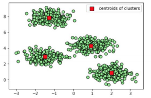
Use scatter plot for plotting result for predicted output,
| for i in range(4):
plt.scatter( X[y_pred == i, 0], X[y_pred == i, 1], s=50, c=’lightgreen’, marker=’o’, edgecolor=’black’) # plot the centroids of each clusters plt.scatter( kmeans_model.cluster_centers_[:, 0], kmeans_model.cluster_centers_[:, 1], s=100, marker=’s’, c=’red’, edgecolor=’black’, label=’centroids of clusters’ ) plt.legend(scatterpoints=1) plt.show() |
For Free, Demo classes Call: 8605110150
Registration Link:Click Here!
Output:
Choice of Right Number of clusters:
Elbow method is useful for this we can choose write number of clusters as follows,
| inertia = []
for i in range(1, 11): kmeans_model = KMeans(n_clusters=i, init=’random’, n_init=15, max_iter=300,random_state=0) kmeans_model.fit(X) inertia.append(kmeans_model.inertia_) # plot plt.plot(range(1, 11), inertia, color=’red’,marker=’s’) plt.plot(range(1, 11), inertia,color=’green’) plt.xlabel(‘clusters Number’) plt.ylabel(‘Inertia of Each clusters’) plt.show() |
Output:
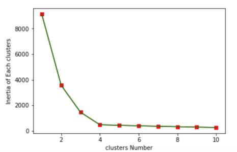
From the above graph we can conclude that only four clusters are possible as graph after cluster number 4 remains steady.
For Free, Demo classes Call: 8605110150
Registration Link:Click Here!
DBSCAN clustering:
DBSCAN stands for density-based spatial clustering of applications with noise. It is an algorithm at the level of human resilience, in contrast to the k methods. This is a great algorithm for finding outsiders in a set of data. It receives randomly generated clusters depending on the number of data points in the various regions. It divides the regions into low-lying areas so that it can find the outside among the larger groups. This algorithm is better than k-means when it comes to working with randomly generated data. DBSCAN uses two parameters to determine how clusters are defined: minPts (the minimum number of data points that need to be grouped together in an area to be considered the maximum) and eps (the distance used to determine whether a data point is in the same area as other data points). Selecting the appropriate first parameters is essential for this algorithm to work.
Implementation:
Dataset is same as like above,
Apply KMeans Model:
set the eps and min_samples to 0.3 and 30 respectively,
| from sklearn.cluster import DBSCAN
db_scan = DBSCAN(eps=0.3, min_samples=30) db_scan.fit(X) y_pred = db_scan.fit_predict(X) |
Plotting Results:
Use scatter plot for plotting result for predicted output,
| plt.figure(figsize=(10,6))
plt.scatter(X[:,0], X[:,1],c=y_pred,s=100,marker=’o’, edgecolor=’black’) plt.title(“Clusters determined by DBSCAN clustering”) |
Output:
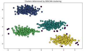
When clusters have no spherical shape then the above algorithm will not work properly for we can use Gaussian mixture model clustering.
For Free, Demo classes Call: 8605110150
Registration Link:Click Here!
Gaussian mixture model clustering:
If data follows a circular pattern then only k-means is going to work. The k-method means that calculating the distance between data points is related to the circular path, so non circular data is not well integrated. This is a problem that is being addressed by the Gaussian hybrids. You do not need circular data to work properly.
The Gaussian mixture model uses multiple Gaussian distributions to match the data set to its liking. There are many single Gaussian models that act as hidden layers in this hybrid model. The model therefore calculates the probability that the data point belongs to a particular distribution of Gaussian and that is the group that will fall into it.
Implementation:
Let’s import the toy dataset from scikit-learn and visualize the data points Use scatter plot for plotting result for predicted output,
| import matplotlib.pyplot as plt
from sklearn.datasets import make_blobs X, y = make_blobs(n_samples=1000, n_features=2, centers=2, cluster_std=0.5, shuffle=True, random_state=0) import numpy as np rng = np.random.RandomState(13) X_stretched = np.dot(X, rng.randn(2, 2)) plt.scatter(X_stretched[:, 0], X_stretched[:, 1], c=’blue’, marker=’o’, edgecolor=’red’, s=100) plt.show() |
Output:
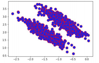
The dataset that we just created consists of 1000 randomly generated points that are grouped into two groups.
For Free, Demo classes Call: 8605110150
Registration Link:Click Here!
Apply Gaussian Mixture Model:
set the number of desired clusters to 2 i.e. n_components,
| from sklearn.mixture import GaussianMixture
gmm = GaussianMixture(n_components=2) gmm.fit(X_stretched) y_pred = gmm.fit_predict(X_stretched) |
Plotting Results:
Use scatter plot for plotting result for predicted output,
| plt.figure(figsize=(10,6))
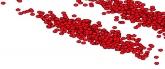
plt.scatter(X_stretched[:,0], X_stretched[:,1],c=”red”,s=100,marker=’o’, edgecolor=’black’) |
Output:

BIRCH clustering:
The Balance Iterative Reducing and Clustering using Hierarchies (BIRCH) algorithm works well on huge data sets but the k-means algorithm will work on small datasets. Breaks data into small summaries included instead of initial data points. Summaries contain as much distribution information about data points as possible. This algorithm is commonly used with other algorithm collections because other integration techniques can be used in summaries created by BIRCH.
The worst thing about the BIRCH algorithm is that it only works on numerical data values. You cannot use this with category values unless you have made some data changes.
Implementation:
Let’s import the toy dataset from scikit-learn and visualize the data points
| from sklearn.cluster import Birch
import matplotlib.pyplot as plt X, clusters = make_blobs(n_samples=600, centers=4, cluster_std=0.80, random_state=32) plt.scatter(X[:, 0], X[:, 1], c=’blue’, marker=’o’, edgecolor=’red’, s=100) plt.show() |
Output:
The dataset that we just created consists of 600 randomly generated points that are grouped into four groups.
Apply BIRCH clustering:
Branching factor and threshold value is only assigned
| brc_model = Birch(branching_factor=100, n_clusters=None, threshold=1.5)
brc_model.fit(X) y_pred = brc_model.predict(X) |
For Free, Demo classes Call: 8605110150
Registration Link:Click Here!
Plotting Results:
Use scatter plot for plotting result for predicted output,
| plt.figure(figsize=(10,6))
plt.scatter(X[:,0], X[:,1], c=y_pred, cmap=’rainbow’,edgecolor=’black’,s=100) |
Output:
OPTICS clustering:
OPTICS stands for Ordering Points to Identify the Clustering Structure. A density-based algorithm similar to DBSCAN, but better because it can find logical collections of data that vary widely. It does this by ordering data points so that the points closest to the neighbors are in order. This makes it easier to find different clusters. The OPTICS
algorithm processes each data point once, similar to DBSCAN (albeit slower than DBSCAN). There is also a special distance reserved for each data point that indicates a point belonging to a particular group.
Implementation:
Dataset is same as above,
Apply OPTICS clustering:
Here we have assigned desired values to min_samples,xi and min_cluster_size as follows,
| from sklearn.cluster import OPTICS
op_model = OPTICS(min_samples=40, xi=0.02, min_cluster_size=0.1) y_op_pred=op_model.fit_predict(X) |
For Free, Demo classes Call: 8605110150
Registration Link:Click Here!
Plotting Results:
Use scatter plot for plotting result for predicted output,
| plt.figure(figsize=(10,6))
plt.scatter(X[:,0], X[:,1], c=y_op_pred, cmap=’rainbow’,edgecolor=’black’,s=100) |
Author:
Amol Kamble
Call the Trainer and Book your free demo Class now!!!
© Copyright 2019 | Sevenmentor Pvt Ltd.

